Welcome!
This is an example of how you could learn how to use real scientific data from SID Space Weather Monitors to locate solar flares, other astronomical phenomena, and possible even electrical interference.
WHAT YOU NEED TO KNOW
- All times are given in Universal Time Why?
- Each place, or site, around the world that hosts a SID monitor has a short nickname -- a unique ID to identify it. Examples are WSO, USU, Jaap, Germany-DLR, Italy-20, India-2, etc. On the graphs, sometimes these names are truncated. You can see where in the world SID monitors are located by looking at the Site Map.
- Each instrument, or monitor, has a serial number. Examples are 0289, 9130, 00455, S-0408-FB-0408, etc. These identifiers are unique to each monitor. Some sites have more than 1 monitor instrument.
- For the SID monitors to be able to track VLF (very low frequency) radio signals, somebody has to be transmitting those VLF signals. Tell me about them. Like radio stations, those transmitters each have separate call names. There are many of these, located around the world. Most sties monitor a transmitter that is relatively close to them. See a list of some transmitters.
Each graph on the SID data page lists the transmitter it is tracking, it's site name, then it's monitor serial number. Here's an example:
NAA Germany-2 S-0082 This mean that the transmitter NAA is being listened to by the site Germany-2 with its S-0082 monitor.- If you are searching for solar flares, it is only data during the daytime that should interest you. (Can you figure out why?) So you need to be able to tell daytime from nighttime data. The SID databrowser indicates sunrises and sunsets for you on the graph. Blue arrows show the sunrise and sunset times at the SID site. (Black arrows show sunrise and sunset for the VLF station being monitored; more on this below). However, some sites have set their latitude and longitude incorrectly, so the sunrise and sunset arrows are incorrect. The best way to tell daytime from nighttime is by the shape of the SID graph. How?
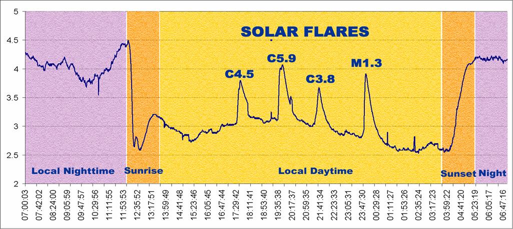
Solar SID data are easy to understand and somewhat similar to those from a seismograph. Look at the graph below: the horizontal axis represents time, in this case about 24 hours. The vertical axis represents strength of the VLF signal being received. (The actual measured values of this aren’t important, only the amount of change.) As you learned above, the strength of the VLF signal changes depending upon the ionization of the Earth’s ionosphere, and that depends upon what is going on on the Sun! Solar flares, and sometimes other astronomical events, show up on SID data as spikes above (or occasionally below) the normal signal strength level. Four solar flares are labeled on the data graph below.
SID data graph showing flares. We added the colors and labels so you could better understand it. In the real data, your flares will not be labeled!Ready, Set, Find Your Flare!
Finding flares in the data is the most important part of this activity. Once you find a flare, the rest is easy! Now, with the date and time of your flare written down, you can go to the SID database to see if any of the monitors picked up your flare. The data browser actually makes it easy for you by labeling known flares at the top of each graph.
If the SID data show your flare, you can start a Flare Report Form. You'll eventually send it to us, and receive a certificate acknowledging your scientific find!
If you couldn't find your flare in the SID database, it may have occurred when most of the monitors were in nighttime. Pick a different flare from the catalog and try again.
Go to the SID Database and follow our instructions below!
You can click on any image below to see it larger.
1. Here's what you see first: The opening screen shows you data for the last day. But you will want to search for a a particular date. So you will need to push the View Data by Date hotlink (pointed to by gold arrow). 
2. Look for your date: The new screen will list dates. Find the one you want. For example, let's use July 23, 2016. Hit that hotlink (pointed to by gold arrow). 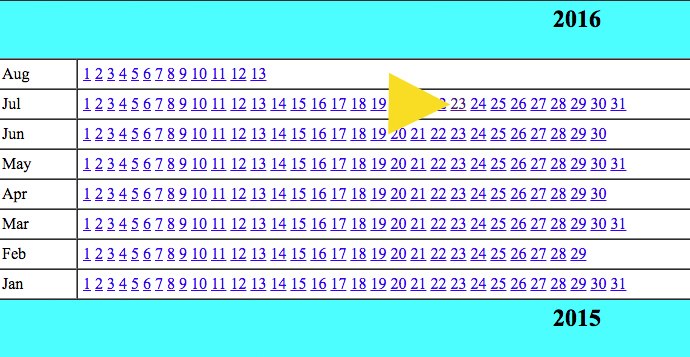
3. Here's the screen for July 23, 2016:
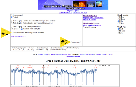
Use the scrollbar on the right to see all the graphs.
Notice that the first graph on the image above is not very good data. We have found a way to help you tell good data from poor (noisy or badly calibrated) data. Look at the arrow labeled #1. It points to a place you can check to Show estimated data quality. If you check that box, and then hit the Update Graph button pointed to by arrow #2, then each graph will be analzyed for quality. Good quality data will have very low numbers, like 1, 2, 3, etc.
4. This screen shot shows the listing of quality data for several graphs. This graph has very noisy data. The quality label is 53, meaning very poor data, and no flares are visible. 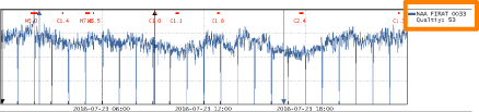
This graph has very good data, with a quality rating of 10. Note that the M6.7 flare we are looking for clearly shows up (orange box). 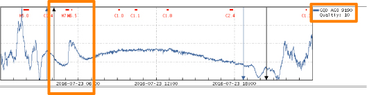
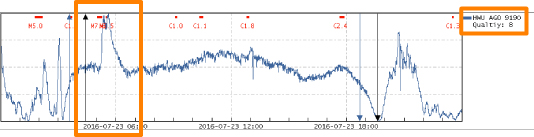
This graph also has very good data, with a quality rating of 8. Note that the M6.7 flare we are looking for also clearly shows up.5. Now, using the scroll bar down the right side, look at all the graphs to see if you notice a peak (or dip) in other data around 05:16:00 GMT. Not all sites will have picked it up because it might have been nighttime at their site, or their monitors were turned off, or not tuned properly.
Sometimes flares are hard to tell from noise and electrical interence. Here are some examples to help distinguish flares in the data
6. Write down the names of the sites and transmitters that appeared to have picked up the flare. When you find one that shows the flare, use the bottom scrollbar to move over to see the name of the site and transmitter. Look at the examples in Step 4 (the orange boxes to the right). The two good graphs we showed in Step 4 are "CQD AGO 9190" and "HWU AGO 9190". The first 3 characters are the names of the transmitters. You can find the location of transmitters. CQD is locating in Skelton, United Kingdom. And HWU is located in Rosnay, France.
In both our good examples, the site was "AGO" and the monitor ID was 9190. Unfortunatley, we do not have a way for you to determine where the sites are (yet).
Did you find other sites that picked up the flare?
Congratulations -- You have completed our flare search example! Now repeat the procedures with your own flare (from Step 2)
Then go on to Step 4